Experiencing the Mockups
- The mockups are static images. They are not clickable and will not fill the screen on huge monitors like the real website will.
- The mockups are best viewed on a large, bright monitor (27") but you'll get an idea of the design on smaller monitors if necessary. On smaller monitors the mockups may be compressed in size.
- When presented as static graphics, some elements like text and colour changes can seem slightly blurry. They will tend to sharpen up in the final website.
- Some parts of the design use real content and others use placeholder elements. If you see latin text - e.g. "lorem ipsum..." - that's just an example of where text can be placed.
Design Notes
Overall
- These page designs extend the home page mockup provided to DDSN without intending to change the design style in any way.
- Content and structure are based on the agreed system interface and information architecture prototypes.
- Some design components have been "webified" to consider web browser functionality and accessibility rules, particularly:
- Links should look like links and nothing else should look like links: A red color convention plus chevrons and/or circle icons have been added to clearly indicate links. (Underlining links is unnecessary with these link indicators, except when hovering or when links are placed within text blocks.)
- Link hover states are indicated.
- Very minor modifications to typography to make sure it fits into a style sheet that functions without custom programming when used in the CMS.
- "Real" content has been added in place of some mockup design components to show how text boxes may need to grow in size depending on content.
- The news feed is indicated as a carousel (not just three static stories) and will expand horizontally to fill the available window space. (A large monitor is required to see this in the mockup.)
- Minor modifications to some image dimensions to standardise layouts and fit into screen heights where necessary - e.g. the videos are a 9x16 ratio and will fit vertically on a standard desktop monitor.
- The size of Facebook and Insta feeds has been adjusted to consider technical constraints with how these feeds need to be coded.
- Dropdown megamenus, image hovering effects, and the sticky header will work as described in the design brief.
- The sticky menu will get slightly shorter when "sticking" upon scrolling the page, and the transparency will disappear so that the header has a 100% white background when scrolling.
- Mobile phone layouts are not shown.
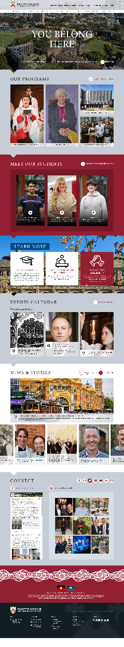
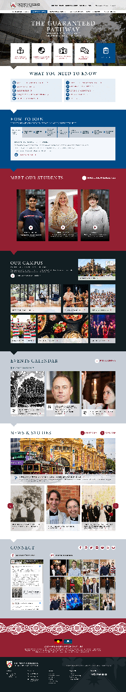
Home Page
- The graphic behind the feature block is a video, darkened so that white text is accessible/readable over the top of it.
- Note this home page is presented without calls-to-action linking to the Resident College, Pathways School, and Theological School dashboards (plus another one or two links such as Apply or Campus Tour). Usability tests very strongly indicated these links are how most users will find their way to the correct vertical area of the website when they first review the home page, so we recommend bringing them back.
- Intended functionality for the news section:
- The large item is the latest item marked as a "feature". Optionally there can be more than one of these which fade in/out slowly in a standard rotating format.
- All other items are a feed of the latest news, presented in a carousel that the user can scroll through.
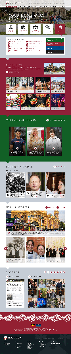
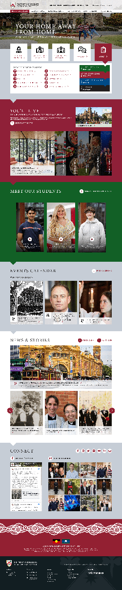
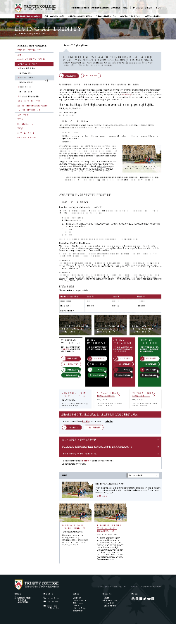
Resident College
- The main menu item is highlighted (red) when in this section.
- Two slightly different header treatments are shown.
- An alternate version of the You'll Live section is shown with the interactive content expander in place of fixed image blocks for Rooms & Facilities, Clubs & Societies, etc.
- A simple infographic intends to show the sequence of important application dates. (A question was asked about the blue colour. We used it because lots of greys tend to wash out the design and there aren't other brand colours available. However we could be a little bit more relaxed here and use other colours if you prefer.)
- The Meet Our Students block can easily be swapped to use different colour backrounds - including white or grey - but using red in the first content block is the strong recommendation.
- (We acknowledge that although the background image we've used in the feature block is a great one in our humble opinion, stakeholders at the College may be tired of it. Any image that suits the layout can be used instead. Multiple images could be used and slowly fade in/out.)
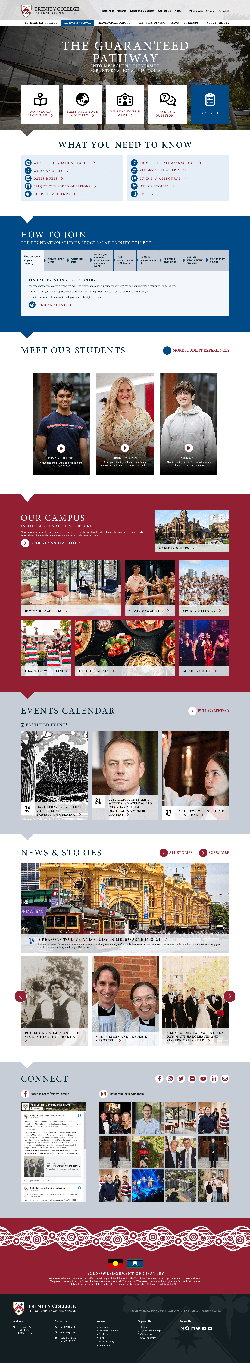
Pathways School
- The main menu item is highlighted (blue) when in this section.
- The blue colour will feature strongly in this section of the site, but links remain red and red/green colours will turn up in secondary content blocks so that the primary Trinity College brand is carried through this part of the website.
- How to Join is presented as a set of clickable tabs so that:
- A large amount of text content can be included on the page without being a long boring page of text. This is good for SEO and the usability of exploring the process without navigating away from the page.
- The process is presented in an infographic-style way, making it clear that it's a sequential procedure.
- Note: We could dress the text content in the tabs up slightly with simple graphics if needed.
- The Our Campus section has been added based on strong feedback from existing Pathways School students in the usability testing sessions that the campus and facilities at Trinity are an important part of their decision to apply. Currently this is a simple copy of the Res Coll content for mockup purposes, but it would be modified slightly to suit the Pathways School section.
- Note: Icon selection in the What You Need to Know section is incomplete.
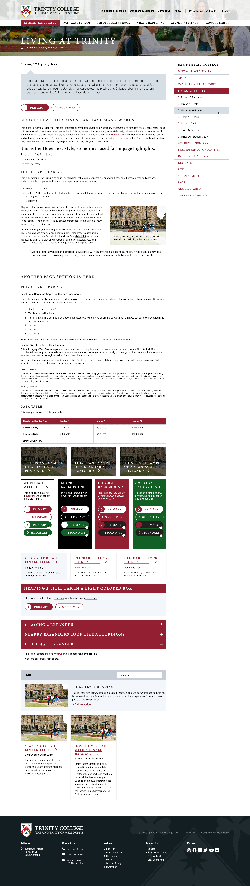
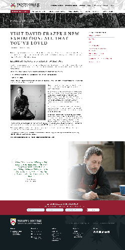
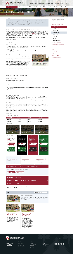
Inner Page Styles
- A full stylesheet is shown to indicate treatment for all headings, text sizes, lists, buttons, header and menu treatment, and common in-page content components. However note that the "kitchen sink" stylesheet does not indicate exactly how a real page of content will look.
- One example of a possible article page has been created to indicate the flexibility of the stylesheet.
- The article page includes an email subscription form at the bottom; this could appear across the whole website or just in selected areas.
- We suggest the site section menu appears on the right side of the page because it helps with the "fresh" feeling of this design, but an example with the menu on the left is also shown.
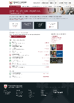
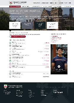
Application Portal
- The existing application portal functional layout has been adjusted to use the new stylesheet and colours.
- Two alternate header treatments are shown. The feature image is flexible in the one with the background image.
- Keep in mind that students have still not completed enrolment at this point. In a way, we are still marketing to them.
- The support menu area on the right could include news or video content, to add something flexible to the portal page beyond the sole focus of the application process.
More Elements
If the overall design style feels right with these pages, there is a little more work to do in finalising some additional components of the website design. Developing final styling for these components is likely happen during the website build phase rather than having mockups created beforehand:
- Dropdown megamenu final layouts
- What's Happening page
- Staff page (to show how people profiles can be represented)
- Some additional common in-page blocks such as blockquotes (though these are indicated in the article page)
- A secondary compilation/colelction card style, to provide some variation, and also a "flip card" style collection treatment
- A small number of feature content blocks
- Image and caption treatment, a couple of examples
- General form styling
- Video and maps treatment
- Example infographic using coloured boxes, icons or images, and flexible column layouts